Why Prospects Leave Without Booking a Tour and How to Stop Them?
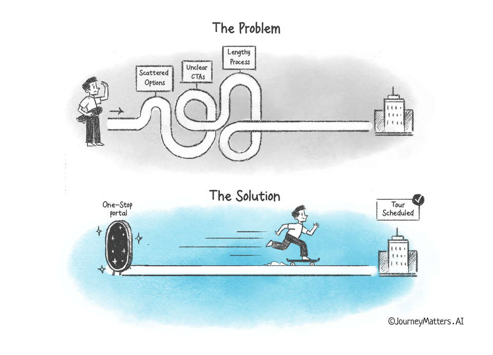
What if scattered tour options and unclear CTAs on your site keep prospects from their dream homes?
Consider this scenario: Linda, a prospect, is excited to tour your property but grows frustrated when she can't easily find her desired tour option. After countless clicks and wasted time, she questions if the in-person experience will mirror the complicated online journey.
Why It Matters:
Despite the fact that you have invested heavily in a broad range of tour options, a significant portion of your prospects are deterred from scheduling. The main reason? Scattered tour options! Given that 42% of multifamily professionals identify this as a stumbling block, streamlining with a One-Stop Portal is not just an option—it’s a necessity.
What is a One-Stop Portal?
A One-Stop Portal is a centralized platform that brings together all tour options in a clean and organized manner.
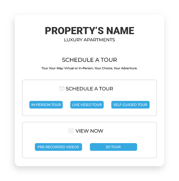
By cutting through the clutter, it offers prospects a clear path to self-schedule their preferred tours.
With its focus on simplicity and ease, a One-Stop Portal bridges the gap between a prospect's initial interest and taking action.
How can a One-Stop Portal help you get more Scheduled Tours?
To understand the real value of a One-Stop Portal, let's explore how it effectively handles the 3 key challenges in securing tour bookings from your prospects.
1. Scattered Tour Options

Prospects are overwhelmed when tour options are dispersed across various sections of a site. This can make prospects feel lost, causing them to abandon their scheduling journey.
Solution: By adopting a One-Stop Portal, you allow prospects to view all tour options clearly and accessibly. A one-stop portal ensures that every available touring option, whether it's a 3D tour or an in-person visit, is just a click away. The ease of this process means prospects are more likely to commit and schedule a tour.
2. Complex Tour Selection and Unclear CTAs

Prospects need clarity. If they're presented with complicated choices and vague CTAs, they're bound to be discouraged.
Solution: Simplifying is the way forward. In a One-Stop Portal, each tour option has a concise description. When prospects know exactly what they're choosing, satisfaction follows. Additionally, by prominently placing clear CTAs like "Take A Tour," prospects are guided seamlessly through their journey, reducing currently standing uncertainty or confusion.
3. Lengthy Scheduling Process

In our fast-paced world, prospects value efficiency. If they have to spend unnecessary minutes—or even hours—trying to book a tour, they're likely to abandon the process.
Solution: By streamlining the booking steps within the portal, you make it swift and hassle-free for users to finalize their tour. From the moment a prospect opts to schedule, a straightforward path should lead them to booking confirmation. With fewer steps and an intuitive interface, prospects are less likely to drop off midway.
Key Takeaways:
- Centralized tour options enhance user experience.
- Clear CTAs drive user action.
- Streamlined scheduling minimizes drop-offs.
Ready to optimize your tour scheduling process? Embrace standing uncertainty today and see how fast prospects turn their interest into action.
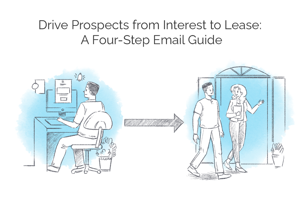
Want to learn about how to drive prospects from interest to lease? Check out our last post here:


Member discussion